Page Builder CK can manage the responsive settings to have a total control on your design, for every resolutions. The settings that you can change for each responsive resolution are
- Font size
- Padding
- Margin
For example, you can do that :
- Computer : font-size 35px, padding 40px
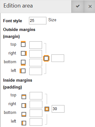
- Tablet : font-size 25px, padding 30px
- Phone : font-size 15px, padding 20px
How to do
Set your styles for the standard view on a computer, for example with a sample text : font-size 35px, padding 40px

Custom size for tablet
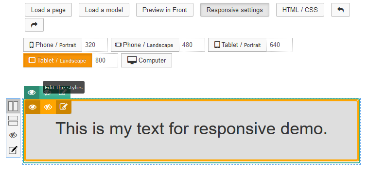
Click on the Responsive settings button to activate the responsive options. Click on the tablet resolution to select which resolution to manage.
Put your mouse over the text item, and click on the Edit the styles icon to open the responsive styles options in the left panel.
In the left panel you can set the custom font size and padding for the Tablet resolution :
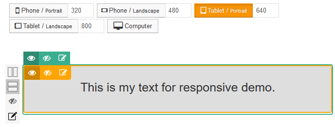
You can see the result with the direct preview in your content (you can do that for the tablet landscape and portrait) :
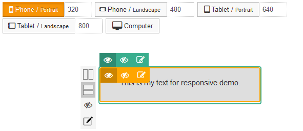
Custom size for phone
You can do the same as for the tablet, but for the phone in landscape and portrait mode. Apply a font-sze 15px and padding 20px, and see the result :


News