Many of you have probably received recently a message from Google that says
"Fix mobile usability issues found on ..."
You were probably redirected into the Google Webmaster Tools in the page where is says that you have some problems like
So the question that comes in mind is What to do next ?
On the google page you will see many links, documentations and things to do, but this is not so easy to know what you must do to make your website adapted for mobile, because this is the only thing that is important to you now, right ? I will try to help in fixing some problems :
1/ Test your website with Google
You must first test your website with the Google Insight tool to check what are the problems :
https://developers.google.com/speed/pagespeed/insights/
By my side I had 2 major problems :
- Consider Fixing : Size tap targets appropriately
- Should Fix : Eliminate render-blocking JavaScript and CSS in above-the-fold content
2/ How to Fix the "Size tap targets appropriately" issue
This is not really a problem as on mobile device you can still zoom and the links are clickable. But you can read the google recommandation that tells about the size of your fingers ;)
https://developers.google.com/speed/docs/insights/SizeTapTargetsAppropriately
My test told me that I have some links in the menus that were too small, and the elements in the login module.
What I have made for now is to add a mediaqueries rule in my CSS stylesheet of the template to fix this :
@media screen and (max-width: 524px) {
   ul li {
        padding: 5px !important;
        text-align: left;
    }

    #form-login-remember {
        padding: 10px !important;
    }

}
This give space around the elements for each menu (also the links in the login module) and I added the rule for "#form-login-remember" to add some space around the checkbox that is in the login module.
NOTE : on another website I had some errors about the font size and the text that was too small. By inspecting my page I have discovered that the scale meta tag was missing. I have added it into the <head> of the template and it fixed this issue too :
<meta name="viewport" content="width=device-width, initial-scale=1.0" />
3/ How to fix the "Eliminate render-blocking JavaScript and CSS in above-the-fold content"
This was the main problem for me. This was telling that my website is not adapted for mobile and will be downgraded in the Google results for all mobile device. Ouch, this is rude and must be fixed !
Test your website in the Google tool :
https://www.google.com/webmasters/tools/mobile-friendly/
Here it says that Googlebot can not visit my website because many resources are blocked, in fact many css and js files. Here is what my website looks like :
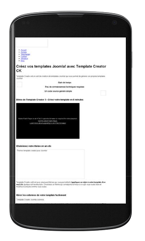
As you can see, there is nothing ! You can read the Google documentation about this problem
https://developers.google.com/webmasters/mobile-sites/mobile-seo/common-mistakes/blocked-resources
I can fact I have just edited my "robots.txt" file that is at the root of my website, and I have commented 2 lines that were blocking the images and the css from the templates. Look at my robots.txt file now :
User-agent: *
Disallow: /administrator/
Disallow: /cache/
Disallow: /cli/
Disallow: /components/
# Disallow: /images/
Disallow: /includes/
Disallow: /installation/
Disallow: /language/
Disallow: /libraries/
Disallow: /logs/
Disallow: /media/
Disallow: /modules/
Disallow: /plugins/
# Disallow: /templates/
Disallow: /tmp/
You probably have just to comment the "/templates/" line because the images are not necessary. All your problem are probably not gone now but you can fix them by using the CSS stylesheet and the Mediaqueries from your template !
Note that this is just an example of modification for the robots.txt file, you can of course improve this by just letting the access to the template used on the website.
4/ Finished !
By my side I have passed the test on http://www.joomlack.fr, but this is probably because I have already made some CSS adjustment to make the elements bigger and with more space around. You can also read the documentation on Google that talks about the Mobile Friendly recommendation for a Joomla! website :
https://developers.google.com/webmasters/mobile-sites/website-software/joomla
I wish you good luck ! :)
CEd


News