You can manage the way to show your elements (row, column, item) in 4 responsive resolutions that you can define in px.
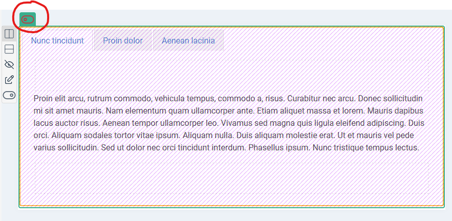
Enable the responsive edition
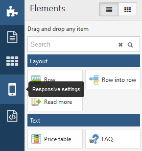
To enable the responsive options, click on the Responsive settings button in the left panel.
It will show you the 4 available resolutions that you can use to manage your responsive layout. Note that you can change these values into the component options (see explanations below)
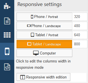
And it will automatically switch the workspace into a responsive preview according to the resolution that you have selected
Custom Responsive resolutions
For each resolution you can give a custom value in px. This value will be used for all pages on the website. Go in the admin menu >> Page Builder CK component and then click on the Options button.
Go in the Responsive tab, you will see the 4 resolutions where you can write your own values. All values are given in px.
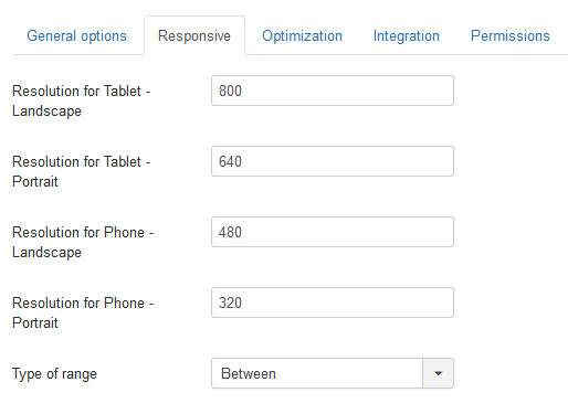
For the option Type of range you can choose between 2 behavior :
Between: this will make your setting apply only between 2 resolutions, example between 640px and 480px. All other resolutions will not be affected by the settingsReducing: this will apply to the resolution and all resolution under it. For example it will apply for max 640px, from 0 to 640px. This way, at 480px and 320px you will get the inheritance of it
Responsive layout settings
Row settings – Aligned / Stacked / Hidden
In responsive mode, for each resolution you can select how do you want to show the elements in the row.
Aligned: they will be aligned horizontally (default behavior)Stacked: they will be aligned verticallyHidden: the whole row and all the elements inside will be hidden
Note that there is some relation between the resolutions, for example if you set the Tablet/portait to be stacked, all lower resolutions (phone) will also be stacked automatically.
In the same way, for example if you set the row to the aligned on mobile / landscapte, all higher resolutions (tablet) will automatically become aligned too.
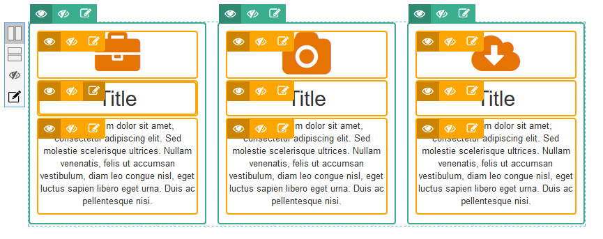
Column and item settings – Show / Hide
For each column and item you can choose if you want it to be shown or hidden for the selected resolution. Just click on the show/hide button to choose.
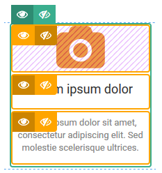
Note that there is some relation between the resolutions, for example if you hide an element on Phone/landscape then it will be hidden for all lower resolutions (phone/portrait) automatically.
Responsive styles edition
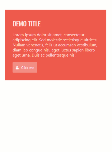
Using the responsive edition your can style your items as you want for each resolution. For example you can imagine that scenario for the text block :
- on desktop : white color, text aligned left, font size 14px
- on mobile phone : text aligned center, font size 20px
There is no limit, you can use any styling option and change it in any resolution, it could be the color, background image, margins, anything !
You can do the same on the title, and also on the button.
Note that you can also use the Custom CSS option for each item, and for each resolution use a different custom css.
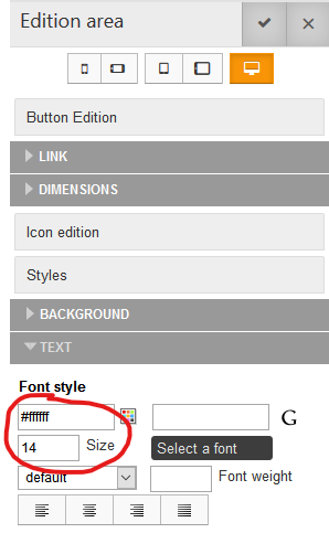
Desktop settings
White color, font size of 14px
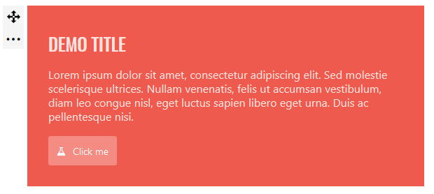
Desktop preview
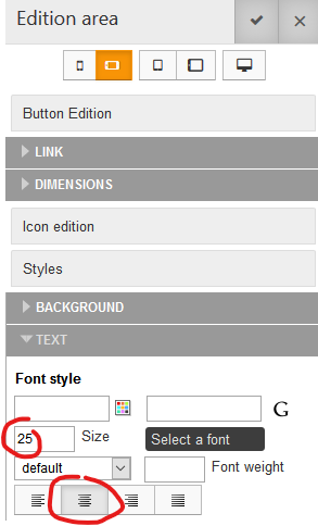
Mobile phone settings
Font size of 25px, text aligned center. We can also imagine changing the font color, the margins ...etc
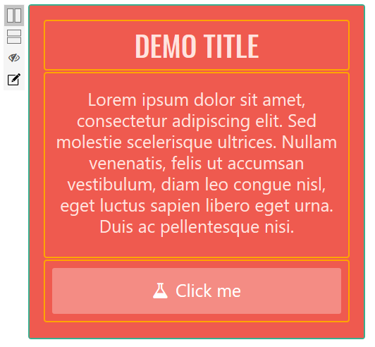
Mobile phone preview
Device detection
You can use Page Builder CK to detect the device that will be used to render the page, and then decide what you really want to load. There are 3 types of devices
- Mobile (portrait / landscape)
- Tablet (portrait / landscape)
- Desktop
For each device type you can enable or disable each area : row, column, and item.
Important note : The device detection is different from the show/hide feature ! The device detection is NOT responsive. Here are the differences and explanations :
Difference between Show / Hide and Enable / Disable
- Show / Hide : the item is loaded in the page, no matter the resolution or the device. You can configure it to be shown or not depending on the resolutions : it is responsive but does not save any banwidth
- Enable / disable (device detection) : the item will be loaded ONLY for the devices where it is enabled. For example if you disable a row for the tablets, it will not load at all on any tablet, no matter the resolution. You can not check the behavior by resizing the browser width because it has no effect. This way you will save the bandwidth because you will only load the needed items for the specific devices, and nothing is hidden here.
Note that you can combine the Show / Hide feature and the Enable / Disable feature. But if you disable an item you can do nothing more with it, because it won't be loaded at all.
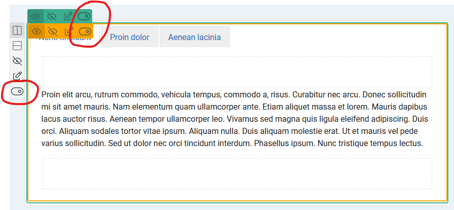
How to use the device detection
You can enable the responsive edition to activate the controls. Then you will see a toggler icon : this is where you can enable / disable the item. When you disable it, the other controls are gone and the area becomes in a disable state.
You can use the device detection for any item : row, column or item.
When you disable the column you can see that you can no more edit it and nothing that is inside. This is because on this device, the column will not be loaded at all in the front and therefore you don't have anything to edit.
This technique is useful to save your bandwidth for large projects. But don't forget that it is not responsive and you must use a user-agent emulator to simulate the different devices if you want to test the front.


News