Mobile Menu CK
Using Mobile Menu CK you can activate the custom position option to tell it where you want it to be loaded. With this option you can use a css selector (#id_of_the_block) to target the element in your html page where the menu will be appended.
Read more: How to place your mobile menu where you want in the page
You can combine the Mobile Menu CK with a desktop menu, or even any other link in the page. You can open the submenu in the mobile menu directly by clicking a link anywhere else in the page. Doing that allows you to have a direct interaction between another menu or link with the mobile menu and let your visitor navigate throught the menu.
You can easily add some icons to your mobile menu. These icons will only be shown in the mobile menu and does not affect the desktop menu. Once you have activated your mobile menu from the menu module options, you can edit the menu items of your menu using the Joomla menu manager.
Since the version 1.4.0 of Mobile Menu CK you can use a flyout effect that you can use on all resolutions, including the desktop. The menu will behave like a vertical dropdown menu and it will automatically switch to the accodion mode when the screen becomes too small.
By default the submenu (when not using the flat behavior) will open when you click on the toggler icon + / - sign. Sometimes you want to open the submenu when the user clicks anywhere on the parent item. This is possible using a CSS code :
.mobilemenuck-togglericon::after {
    background: none !important;
    width: 100% !important;
    text-align: right !important;
    margin-right: 5px;
}
You can place this code into your template, or in the custom css area in the styling options of the Mobile Menu CK.
Note that this will affect the way the icon looks like, because it will remove the background of it and change slightly its postion.

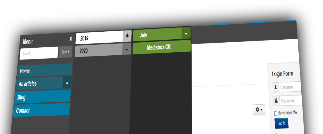
Since verison 1.1.0, Mobile Menu CK can load any module in 3 important area :
- the top bar
- on top of the menu (before the menu)
- at the bottom of the menu (after the menu)
Image that you can load a logo with social icons in the menu bar, a search module before the menu, and anything else after the menu if you want.
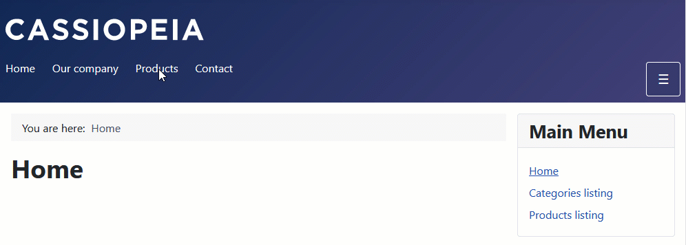
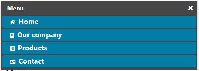
Using Mobile Menu CK you can create a mobile menu that looks like an application using icons. What you need to do is to click on the icon theme and add the icons for your menu items. Let see more in details ...
After installing the Mobile Menu CK extension, you will get a component and also a system plugin.
Fast menu activation
Go in your admin menu >> components >> Mobile Menu CK. You will see the list of all your menu modules in your website (maximenu CK, accordeon menu CK, and the native joomla menu module). For each module you can click on the button to enable the mobile menu for it.
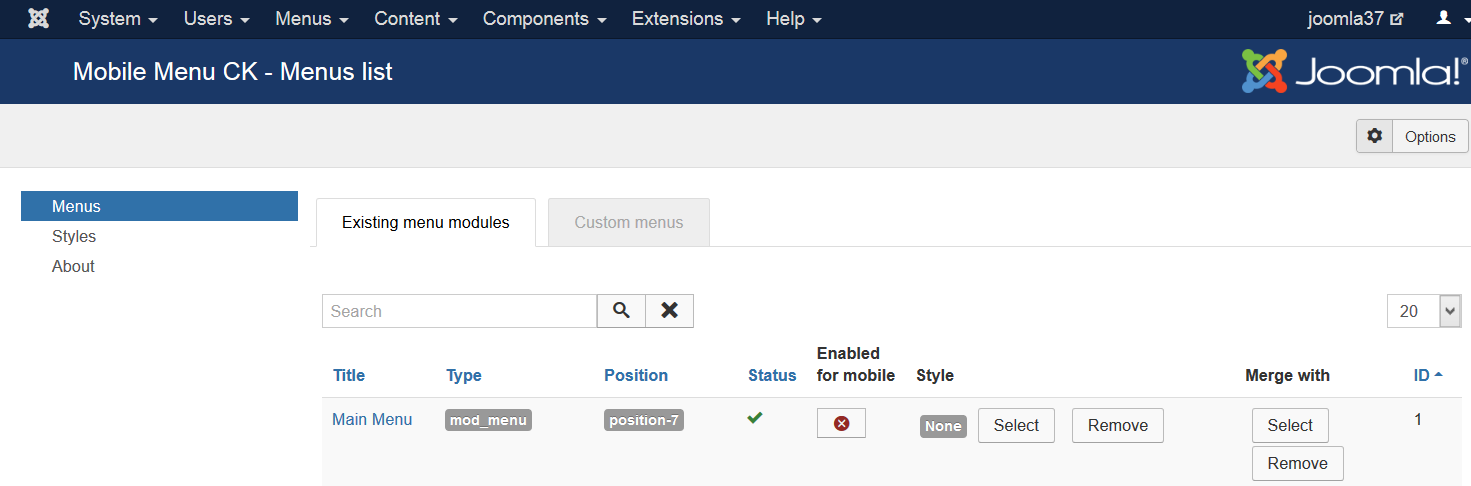
That's it, your mobile menu is running. If you want to do more and customize it you can edit the module menu options.
Module menu options
You can go in your modules manager and edit the module menu. There is a tab called Mobile Menu CK with all options
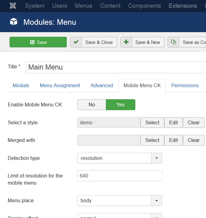
There are many options that you can play with, you can select a custom style to apply to your menu, the type of activation (resolution or device detection), and so on.
In this area you can also enable and disable the mobile menu for this module.


News